Tuesday, 7 May 2013

Technology

Throughout this process, I have had to learn about a few new pieces of technology, mainly the use of sites and programs on the Apple Macs. 

To edit my images I used picmonkey, an editing site that I have used before to edit pictures but I also learnt how to use pixlr incase I wanted to use any other effects such as layering that picmonkey was unable to offer. I learnt how to layer in class time and an example is shown in my earlier work with my Green Day edit. 

Blogger was also a site that I was unfamiliar with an so I had to learn from the very basics of how to use it... even how to make an account. After making an account I had to figure out how to change my layout which wasn't as hard as I first though, thankfully. 


Pages. Okay, so learning how to use pages does seem like it would be very hard but I was very used to using Publisher or Word on a PC and so thought they would be pretty similar. To be honest, I didn't even know how to open Pages on a Mac the first time I used one let alone know how to put pictures on it. After learning this I then had to change the layout of my page from A4 landscape to A3. I didn't even know where to begin. Now, I know pretty much all the setting and uses of pages and figuring out how to use one was definitely my biggest challenge.

Friday, 3 May 2013

Preliminary task VS Main task


As you can see from the two pictures, my preliminary task didn't look much like a magazine. The name of 'Southfield School' doesn't really look like a mast head should as it is quite plain but is fully visible. However, through the process I've learnt that the masthead doesn't need to be seen especially if the magazine is well known. In my preliminary task, the information in the magazine is sometimes unclear and the writing is the same as the masthead. I intentionally made the writing the same as the masthead as I thought it would tie the two together. Looking back on this I see that it just looks very simple and boring which is why I made the font in my main task different for different stories featured. Also, the masthead is the largest and stands out the most with the white against the black. As I thought my school magazine would be free to students, a price or barcode wasn't included on the front, however my music magazine conventionally has barcodes on the cover and so I have included on in the bottom right. 


Looking back, my preliminary task was very basic. The red is very bright and should usually be used to make certain things stand out. However, my main task used the red less and isn't quite as bright. Also, the font for my preliminary task is very basic and plan. Although it's supposed to be a school magazine it doesn't attract the target audiences attention is it supposed to be students. Like the preliminary task, the writing on the contents page of my main task is quite plain but there is the main title of the contents and the font on the black text boxes that make it interesting. The competition on the contents of the main task stands out the most as it is bright and the main thing that is red except the text box for the title. I wanted this to be so as my first contents page had a lot of red which didn't attract the eye to any part of the page whereas the competition bring in the eye. 

Although I didn't so a double page spread for my preliminary task, I feel as though this would've been better than the other as I have learnt more how to structure and what to include in a magazine since the beginning of this process.

Media Institution that might distribute my magazine

A media institution is a non-profit organisation that distributes media for entertainment of the public such as the BBC, Emap and Future PLC. Bauer Media owns 4music, The Box, Heat, Kerrang!, Kiss, Magic and Smash Hits. This media institution distributes Kerrang! magazine and as my magazine is based on Kerrang! this would be an ideal distributer.

Feedback


How my magazine represents social groups


My Target Audience


Magazine Conventions


Double Page Spread


At first I put my writing to the right hand side but then decided to move my image as it was bright and stood out. I then moved my writing down and put a white line with a rough edge around it. To drop cap the A at the top and K in the article, I had to make them individual letters and put them near the text. I originally put a red bar across the bottom to put quote from the band in but when the image was moved it looked better just as decoration. 'New Chapter' was made by moving the characters 'ew' and 'hapter' closer together, making the 'N' and 'C' red and drawing the two white lines above with the red line through it.

Contents page

Looking back, I should have saved my process to get to this finish product but this what I did to get here. Firstly, I put my main image on the left hand side and added a little bit of black at the top of the page to create the illusion that the image finishes there, I did this because I wanted to follow the conventions of a Kerrang! magazine where they have this style but my image wasn't long enough. I then added the long red rectangle. As I wasn't able to put a rough edge on it, which is my house style, I added a second shape but with just the outline and placed it over top. In a typical Kerrang! magazine the line down the centre would be grey but I used red with a rough edge instead as I wanted to show a clear division. I then made the black text boxes, the red writing for the numbers and the articles in the magazine. I used an outline for the text around the editors section and made the competition section.  

Front cover


To make this image, I deleted the background and used 'Tint' on Picmonkey.com to make the females hair red. To do this I made the whole image tinted red and then erased everywhere but her hair to make her stand out. I also made the brightness higher.


I then used 'Instant alpha' to get rid of the white and make it so that I could put the image on my magazine front cover. 


Once, I added the picture to the black background, I put the Masthead to the back and covered the bottom of it with the main image. I then added a menu bar at the bottom to show what else is included in the magazine which has the shout out of 'Extra'. I added the barcode to make it would be sold in stores. I added the shout out 'Exclusive' and put other features around the main story but with small writing so they didn't stand out as much. The posters the side are to show there are additional features of the magazine like posters. Lastly, I put a burst at the top to attract the reader to see the competition. 

Final Magazine

Front Cover
 

Contents page

Double Page spread

Friday, 26 April 2013

Double page spread drafts

1st draft with unoriginal picture
 
The main image fills the whole page except the right hand side which is where I would put my article. The name 'New Chapter' is the band's name and the font is just a draft to see where it might go. The main colours in the picture are red, green and black where as my colour scheme is red black and white so I have made sure not to have green lights in my picture. The red bar is purely decorative and ties in the red with the black on the right.


 1st draft with original photo and change in layout

My main image fills most of the page but as I like the colour I have edited it to I might move it around to fill even more of the page. I plan to move the red and white line at the top to be inline with the 2nd white line, not have the text boxes as grey and move them to the bottom to make more room for the image. What I like about the page is the bands name at the top left and the red line across the page at the bottom.

Thursday, 25 April 2013

Preliminary task- contents page


My contents page has a clear and simple format which is easy for everyone to see. The pictures make the page more interesting and give an idea of what might be in the magazine. The text and layout is a bit boring but for a school magazine it may be suitable. The contents page has my colour scheme of red, black and white, the writing to the left as it's usually more appealing to eye. Overall, I'm not very pleased with this work as it looks basic. 
 

Tuesday, 16 April 2013

Pictures for contents page and double page spread

Contents page- plain, simple image of performance


 With the green light from the left, I thought that it was too much and prefered just the red light. On a second look I thought that the red light was very much in the singers face and decided to repeat the process but more the red light down, so it was less in her face.


Overall, I am happy with this picture it looks bright and fun, which is how I want to portray the band. The dark edges help the background of my double page spread (black) to blend better with the picture so it doesn't look out of place and the red light goes with the colour scheme throught the magazine.

Article Draft

After the highs and lows of losing their former lead singer, New Chapter are finally back on track and, boy, did they rock out. With their new take on alternative/heavy rock, they took Knibbfest by storm.
Knibbfest is a charity fund raising event with the aims to bring rock bands from around Northamptonshire together to raise money for Cancer Research. Out of the five performing acts we all know who shone the brighest. New Chapter stood out from the screamo crowd there and entertained everyone with their new take on songs like 'Rolling in the deep'- Adele and 'When the sun goes down'- Artic Monkeys. New Chapter, with their new singer Zahra Sullivan, really took centre stage.
In an interview with New Chapter, drummer Kurtis Sage said 'It wsas absolutely awesome. We couldn't believe how well our set had gone and the crowds positive response to our unique changes with the songs was amazing.' When asked the next date of a performance, Todd Harper the bassist said 'We hope to be performing soon once we've had some more time to make some more original songs and alter some exisiting songs to our sound.. it may take a while.'
So, unfortunatley, it seems we won't be seeing New Chapter anytime soon but with another Knibbfest to be arranged in the next couple of months, will we see a return once more for New Chapter? Here at The Bass we hope we will.

Monday, 15 April 2013

Hazards

As with any picture taking, there are risks with equipment and setting. My front cover will be taken in an empty room so there will be minimum safety risk. However, the images for my contents page and double page spread have both been taken on a stage with wires and other musical equipment. The wires could become a safety hazard so organisation of the wires was arranged as well as making sure the musical equipment was out of the way of the band members.

Technology

To construct my magazine, I will use the image editing site Pixlr and pages on Apple Macs. As I have used these programs in previous editing. Using picmonkey I will change the brightness and colours on my final piece, whereas Pixlr would be used for movement in the figures.
I will also use my nikon camera to take the shots to then upload to a Apple Mac for editing.

Draft image for Front cover


With the band I am using for my photograph, the 4 males will be closer to her, like in this picture, and slightly further back to get them all in the shot. The title will be at the back behind the members heads. The band I have chosen to photograph is called 'New Chapter' and their name will be ruffly where it is in the edited draft.

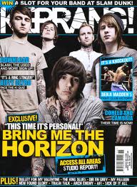
Kerrang! Magazine front covers


These are all typical Kerrang! magazine front covers. All the bands are centred in the middle with plain backgrounds and the band name written in large, bold, writing. At the very bottom is a sell line and the barcode is placed to the right hand side where it seems least in view. The colour scheme is usually white, black and then another colour depending on the photo. The lead singer is usually at the front and the other band members surrounding him/her. Kerrang! is covered by the band members but is still recognisable from the famous font and house style. Throughout my magazine I plan to have a house style with a similar layout and picture. 


Wednesday, 20 March 2013

Kerrang! Contents and Double page spread

Kerrang! Contents page
   
Yellow, black and white colour scheme with red writing to make the competition stand out. Large picture of items to be won by red writing. Subscription to the right side underneath a numbered list of what the magazine includes. 

Kerrang! Double page spread
Yellow, black and white colour scheme to match the contents. Red used to highlight the play on words with the bands name and title of the article. Large image of the band to the right, overlapping the title. Article in a box to the left with smaller yellow boxes dotted around page. 
Using this double page spread as a template: I will position my writing to the right side of the page, instead of the left and the picture in the left. Instead of using a casual picture of the band, I will use a picture of them in concert to show their artistic skills and have a darker image background. My image will cover most of the page, approximately 3/4, and the writing will cover the bottom right corner. Like the image above, my banner will be positioned at the left hand side of the page with a play on words with the name of the band, 'New Chapter'.