Wednesday 20 March 2013

Kerrang! Contents and Double page spread

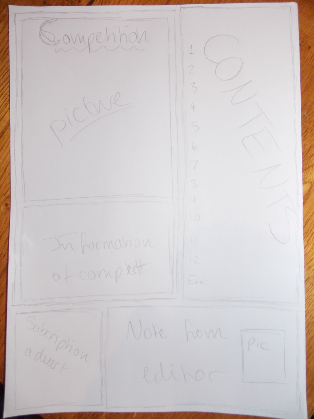
Kerrang! Contents page
   
Yellow, black and white colour scheme with red writing to make the competition stand out. Large picture of items to be won by red writing. Subscription to the right side underneath a numbered list of what the magazine includes. 

Kerrang! Double page spread
Yellow, black and white colour scheme to match the contents. Red used to highlight the play on words with the bands name and title of the article. Large image of the band to the right, overlapping the title. Article in a box to the left with smaller yellow boxes dotted around page. 
Using this double page spread as a template: I will position my writing to the right side of the page, instead of the left and the picture in the left. Instead of using a casual picture of the band, I will use a picture of them in concert to show their artistic skills and have a darker image background. My image will cover most of the page, approximately 3/4, and the writing will cover the bottom right corner. Like the image above, my banner will be positioned at the left hand side of the page with a play on words with the name of the band, 'New Chapter'.

Monday 18 March 2013

Draft for my Magazine

Title page


Contents page


First photo edit

Original image


  1. Using pixlr.com, I duplicated the original image and made the duplicate black and white. 
  2. I put the duplicate image underneath the original. 
  3. Using the rubber tool, I erased the tie and eyes from the black and white duplicate. 
  4. With these erased, I made the original image green which allowed the eyes and tie to be seen as green in the duplicate image. 
  5. Using pages on a Apple Mac, I erased the grey background from the duplicate. 
  6. I then found the writing 'Green day' using Google images and placed the image of Green day over it. 


Edited image 

If I could do the edit again, I would be more careful in erasing the grey background as part of the elbow of the individuals on the right and middle are missing. I also would make the tie match the writing in the background to make a stronger connection between the two.   

Target audience

I have decided to base my magazine upon Kerrang! after looking through several genres and make a heavy metal/rock based.
My target audience is aged around 16+ or anyone interested in the rock- metal genres. Females and male would both read this kind of magazine and the ethnicity would be towards white caucasians, although anyone could read it if the music style attracted them. Their socio economic group would probably be C1 or C2 as middle to upper class people wouldn't be drawn to it.
I have chosen this target audience as it is a popular genre being sold currently, as around 40,000 copies have been sold from previous research.
Image of a typical reader of my magazine. 

  1. Facial piercings. 
  2. Dark eye make up
  3. Maybe coloured hair. May be dyed black. 
  4. Caucasian, although not necessary. 
  5. Teenage around the age of 16, can be older. 

Circulation

Sparkle World : 78,816 - % change y/y: 20.7 - Sold copies: 78,816
- This magazine may have increased in sales for reasons such as girls reading at an earlier age to boys, to increase their ability, or that young girls is a large demographic. 

Top of the Pops : 78,352 - % change y/y: -20.1 - Sold copies: 78,352
- The decrease of sale for this music magazine may be caused by an increase in competition or lack of interest in the magazine. 

Kerrang! : 40,203 - % change y/y: -6.6 - Sold copies: 39,950
- Decrease in sales, perhaps, because of increased competition, change in music genre or loss of interest. 

What Car? : 72,384 - % change y/y: -11.8 - Sold copies: 72,273
- Perhaps, less sold because of higher/better competition. Not a huge drop in sales though. 

NME Contents and Double page spread


Contents
 
Numbers to the right. Easily find a band at the left side. Small article in the centre with advertisement underneath. Colour scheme of red, black and white with yellow writing to make the advertisement stand out. 


Double page spread
Same colour scheme, of red, white and black, as the contents page to show this is the main story. Florence as the largest image. USA flag underneath her to show the connection between the story and the large writing in the background. 

History of Music Magazines

Kerrang! magazine

First set up: The magazine was first made as a one-off supplement to the Newpapaer 'Sounds' in June 1981. Angus Young from AC/DC appeared on the first Kerrang! cover which was launched monthly. As its popularity rose it went to fortnightly then weekly. As different music genres became more popular, the magazine would change its content to fit the 'bigger' music of the present time. Kerrang! has been through many genres such as thrash, glam metal, grunge, emo and metalcore. Readers have often criticised the magazine for changing everytime a new music genre came out.
Typical content: The music magazine usually features information about bands rising to fame and the recent news of other bands. Kerrang! also features gig information for both small and large bands as well as some letters from fans of the magazine with their stories about 'Rock Grannies' and 'Rock stories'.
Typical reader: Older teenagers to young adults who prefer rock to metal genres.
House style: Colours on the front match colour scheme in the double page spread, highlighting it's significant.  
Producers and distributors: The Bauer Media Group,  Gordon and Gotch. 

NME magazine
First set up: Originally known as 'The New Musical Express', Nme was first printed 7th March 1952 weekly and created by Theodore Smythson as a music journalism publication in the UK. After the 'Accordion Times and Musical Express' was brought by Maurice Kinn, the magazine was relaunched as 'The New Musical Express' was created the first UK Singles Chart.
Typical contents: NME magazine usually features information about popular bands and the members opinions on current events. NME also has information about gigs and performances of bands in different regions of the UK.

Typical reader: Teenage to young adults indie rock readers.
House style: Bold main image. Smaller images in the corner with usually red used.