Tuesday, 7 May 2013

Technology

Throughout this process, I have had to learn about a few new pieces of technology, mainly the use of sites and programs on the Apple Macs. 

To edit my images I used picmonkey, an editing site that I have used before to edit pictures but I also learnt how to use pixlr incase I wanted to use any other effects such as layering that picmonkey was unable to offer. I learnt how to layer in class time and an example is shown in my earlier work with my Green Day edit. 

Blogger was also a site that I was unfamiliar with an so I had to learn from the very basics of how to use it... even how to make an account. After making an account I had to figure out how to change my layout which wasn't as hard as I first though, thankfully. 


Pages. Okay, so learning how to use pages does seem like it would be very hard but I was very used to using Publisher or Word on a PC and so thought they would be pretty similar. To be honest, I didn't even know how to open Pages on a Mac the first time I used one let alone know how to put pictures on it. After learning this I then had to change the layout of my page from A4 landscape to A3. I didn't even know where to begin. Now, I know pretty much all the setting and uses of pages and figuring out how to use one was definitely my biggest challenge.

Friday, 3 May 2013

Preliminary task VS Main task


As you can see from the two pictures, my preliminary task didn't look much like a magazine. The name of 'Southfield School' doesn't really look like a mast head should as it is quite plain but is fully visible. However, through the process I've learnt that the masthead doesn't need to be seen especially if the magazine is well known. In my preliminary task, the information in the magazine is sometimes unclear and the writing is the same as the masthead. I intentionally made the writing the same as the masthead as I thought it would tie the two together. Looking back on this I see that it just looks very simple and boring which is why I made the font in my main task different for different stories featured. Also, the masthead is the largest and stands out the most with the white against the black. As I thought my school magazine would be free to students, a price or barcode wasn't included on the front, however my music magazine conventionally has barcodes on the cover and so I have included on in the bottom right. 


Looking back, my preliminary task was very basic. The red is very bright and should usually be used to make certain things stand out. However, my main task used the red less and isn't quite as bright. Also, the font for my preliminary task is very basic and plan. Although it's supposed to be a school magazine it doesn't attract the target audiences attention is it supposed to be students. Like the preliminary task, the writing on the contents page of my main task is quite plain but there is the main title of the contents and the font on the black text boxes that make it interesting. The competition on the contents of the main task stands out the most as it is bright and the main thing that is red except the text box for the title. I wanted this to be so as my first contents page had a lot of red which didn't attract the eye to any part of the page whereas the competition bring in the eye. 

Although I didn't so a double page spread for my preliminary task, I feel as though this would've been better than the other as I have learnt more how to structure and what to include in a magazine since the beginning of this process.

Media Institution that might distribute my magazine

A media institution is a non-profit organisation that distributes media for entertainment of the public such as the BBC, Emap and Future PLC. Bauer Media owns 4music, The Box, Heat, Kerrang!, Kiss, Magic and Smash Hits. This media institution distributes Kerrang! magazine and as my magazine is based on Kerrang! this would be an ideal distributer.

Feedback


How my magazine represents social groups


My Target Audience


Magazine Conventions


Double Page Spread


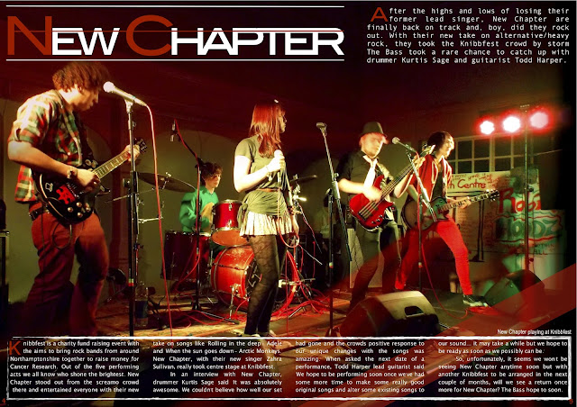
At first I put my writing to the right hand side but then decided to move my image as it was bright and stood out. I then moved my writing down and put a white line with a rough edge around it. To drop cap the A at the top and K in the article, I had to make them individual letters and put them near the text. I originally put a red bar across the bottom to put quote from the band in but when the image was moved it looked better just as decoration. 'New Chapter' was made by moving the characters 'ew' and 'hapter' closer together, making the 'N' and 'C' red and drawing the two white lines above with the red line through it.

Contents page

Looking back, I should have saved my process to get to this finish product but this what I did to get here. Firstly, I put my main image on the left hand side and added a little bit of black at the top of the page to create the illusion that the image finishes there, I did this because I wanted to follow the conventions of a Kerrang! magazine where they have this style but my image wasn't long enough. I then added the long red rectangle. As I wasn't able to put a rough edge on it, which is my house style, I added a second shape but with just the outline and placed it over top. In a typical Kerrang! magazine the line down the centre would be grey but I used red with a rough edge instead as I wanted to show a clear division. I then made the black text boxes, the red writing for the numbers and the articles in the magazine. I used an outline for the text around the editors section and made the competition section.  

Front cover


To make this image, I deleted the background and used 'Tint' on Picmonkey.com to make the females hair red. To do this I made the whole image tinted red and then erased everywhere but her hair to make her stand out. I also made the brightness higher.


I then used 'Instant alpha' to get rid of the white and make it so that I could put the image on my magazine front cover. 


Once, I added the picture to the black background, I put the Masthead to the back and covered the bottom of it with the main image. I then added a menu bar at the bottom to show what else is included in the magazine which has the shout out of 'Extra'. I added the barcode to make it would be sold in stores. I added the shout out 'Exclusive' and put other features around the main story but with small writing so they didn't stand out as much. The posters the side are to show there are additional features of the magazine like posters. Lastly, I put a burst at the top to attract the reader to see the competition. 

Final Magazine

Front Cover
 

Contents page

Double Page spread